Originally Published 5/28/2011
When introduced to return loss in the context of antenna impedance matching, my first thought was 'the RF gurus must be playing a joke.'
Return Loss Visualization

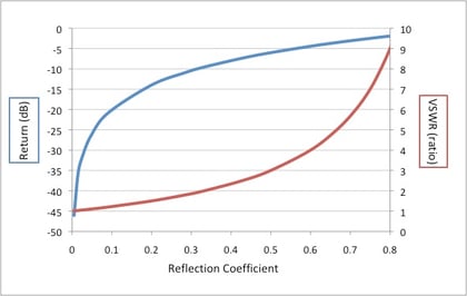
How can good function be indicated by a graph that has a deep gully as its desirable feature?
This comes about from the oblique notion that the greater the loss of a signal injected into an antenna (measured by the reflected return), the better it is. The energy in those gully electrons is being transformed into photons flowing out from the device into the aether! So, lots of reflection is bad, and lots of ‘loss’ is good. Confused yet?
VSWR Ratio
Now, of course in good black art fashion, there is another graph that shows the same information in a similarly obfuscating way…the VSWR (voltage standing wave ratio) plot. Again, less is more, as the closer the graph is to a 1:1 ratio (typically at the origin ordinate) the better the impedance match, and therefore the maximum energy transfer from electrical circuit to radiating electric field (for e-field antennas anyway).
Further Reading
There are some great visualization aids for these related concepts at http://www.microwaves101.com/encyclopedias/vswr give them a look, you’ll raise your comfort level and intuitive feel significantly!


